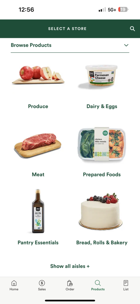
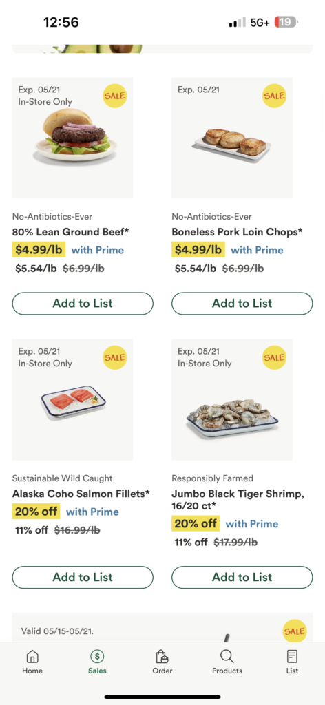
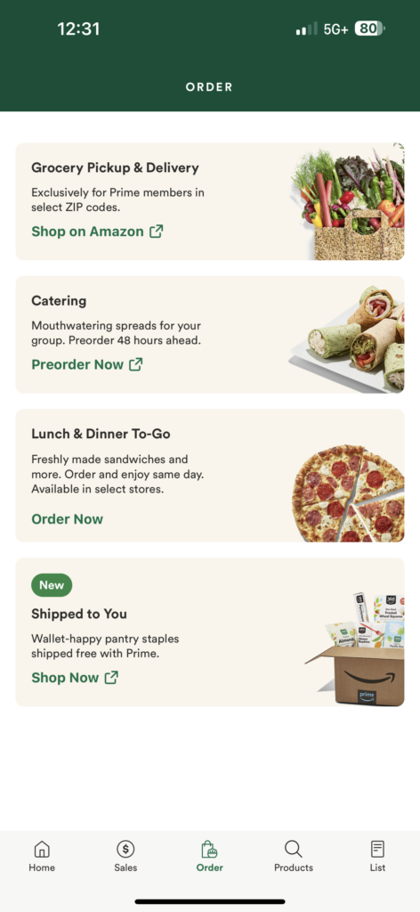
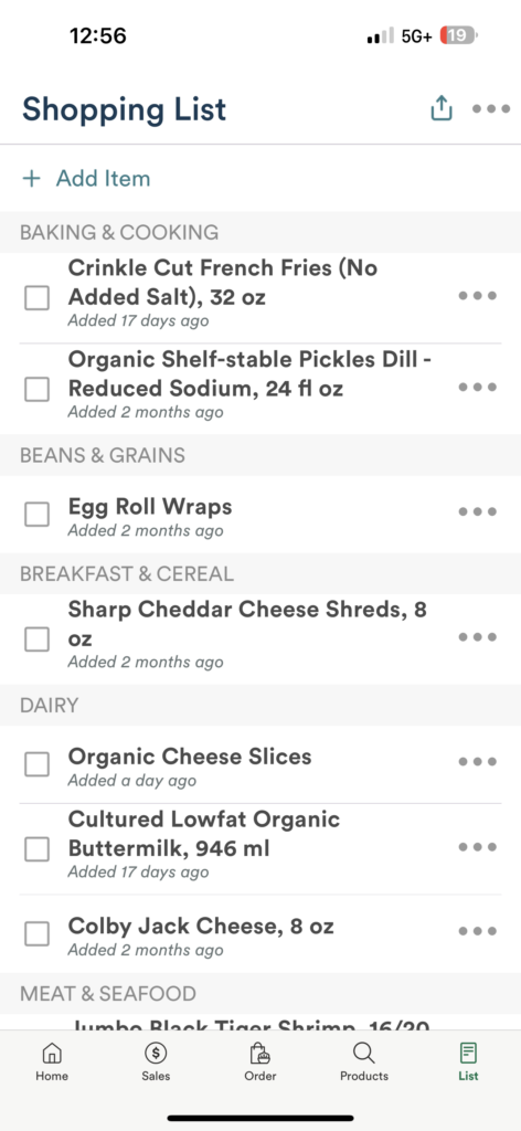
The first design piece I will be critiquing today is the Whole Foods mobile app layout anddesign. The use of design properties is evident throughout the layout. Similarity is displayed withthe consistent use of color schemes, typography, and hierarchy. Continuity is shown through theorganization of the layout with the use of symbols and icons, allowing users to move around swiftly. The use of borders achieves closure and proximity by separating the different sections ofthe layout and grouping items together, such as product categories and featured promotions.Figure and ground are utilized throughout the entire layout, not just to display featured products but all products the user might be searching for, making it easy to identify your needs. Symmetry and order are shown when looking up products; they will all display the product name, picture, ingredients, and possible allergies. They also have an easy-to-understand navigation bar labeled with icons at the bottom, allowing buyers to go from searching to viewing items on the list with a quick click. Overall, the Whole Foods app does a great job at balancing their layout and their use of space to effectively communicate that they are a high-end grocery store that values quality. Equipped with a multitude of features like a virtual grocery list, pick-up and delivery options, and much more, one thing that they can improve on is adding more interactive things such as a chat robot and a directory map for the store to help in-store shoppers locate items easily.


The second design piece I will be critiquing today is food product labels and their effectiveness in communicating their meaning using design principles. Food product labels are an essential element in conveying information to consumers and establishing brand identity. When analyzing food product labels, the use of similarity and continuity design principles through the consistent use of colors, fonts, and imagery can help brands establish a recognizable visual identity. Figure and ground principles are used to create a sense of hierarchy by drawing consumers’ attention to more key elements such as product name or brand logos. As a result, this creates a sense of familiarity that can ultimately strengthen brand recognition and consumer loyalty. Closure is achieved with the use of borders and white spaces to create a sense of organization that displays essential information in a structured manner. While symmetry and order create a balancing aesthetic that can create a more appealing visual experience for the consumer,. In conclusion, a visually appealing and informative label can enhance the overall consumer experience and brand loyalty. I personally am not a fan of most brand labels. I find that the use of proximity and common flow by placing product information all in one small area can deter consumers from purchasing their products. Though you can easily look up a brand and any public information about it online, brands should add a QR code to the back of all their products that can link consumers to not just the ingredients but also the facility where the product is produced, Q&A’s, and information about the founder. This can create more space on the label and better transparency between distributors and consumers.